Brand Book — Working Draft
The future of connection
Scroll to enter
Brand Book — Working Draft
The future of connection
Scroll to enter
01 — Brand Essence
CX is an underground social club meets secret society based in NYC—created by artists, writers, and musicians who craft immersive experiences: elaborate parties, intimate dinners, artist interviews, and curated playlists.
A collaborative creative ecosystem built for authentic connection and collective momentum. Not mass. Not loud. Not corporate. Invitation-only energy. Everything feels found, not advertised.
“CX is the new Studio 54—without having to say it.”
01
Living ritual, always in flux
02
A break in the system
03
Collision of diverse minds, no hierarchy
04
Maximum feeling, zero filter
02 — Voice & Copy
Poetic when it matters; blunt when it clarifies. Short sentences. High contrast. No foam.
“This way in.”
“A signal from the underground.”
“We have a secret to share with you…”
A living, breathing
creative ecosystem
03 — Visual Identity
Not as style, as intent—artist-led, living, evolving. Every version is valid as long as it remains hand-made and expressive.

Thick

Thin
Small sizes, mobile, social, favicon-like moments.
Large-scale, refined print, deck covers, cinematic negative space.
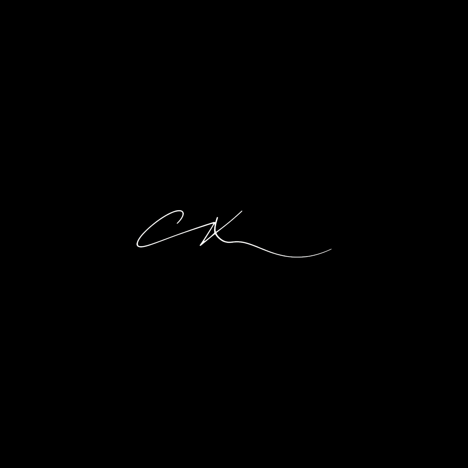
No text or objects within a distance equal to the height of the “C” stroke. Keep a generous exclusion zone around the mark.
Five official variants. Use the thick mark at small sizes, mobile, social, and favicon contexts. Use the thin mark for large-scale print, deck covers, and cinematic presentations.
Headlines
Big Caslon
Classic, editorial gravitas
H1: 54–76 pt · Tight phrasing, generous leading
H2: 28–40 pt · Semibold option
Body & UI
Proxima Nova
Modern clarity, clean rhythm
Body: 18–24 pt · Regular weight
Caption: 12–14 pt
Micro-labels · All caps · +120–200 tracking
Interactive Type Scale
Hover to isolate · Type to preview
Sans-serif Scale
Use sentence case or uppercase. Avoid Title Case except proper names.
Headlines: no full stops. Body: full punctuation. Bullets: no full stops unless full sentences.
04 — Color System
Designs are primarily black + white with black dominant. Colors are accents—signals, not palette. If you add accent color, remove something else.
Click any swatch to copy its hex value
Hover to preview · Click to copy
Hover a color to explore
“One accent per composition. Think signal, not palette.”
05 — Grid & Layout
Decks
Social
Stories
Always 10–20%. Internal gaps should feel related—often equal or in a simple ratio to margins.
Subtle raw textures—grain, brush, paper creases—keep the work human. Dark backgrounds: “copyscan” style, Exclusion ~50%. White backgrounds: same, ~10%.
Texture should be felt, not noticed.
06 — Photography
2.39 : 1
Cinematic aspect ratio
Every image must look cinematic and deliberate—never stocky.
Prefer shallow depth-of-field, documentary texture, dramatic light.
Avoid office brochure energy. Images are evidence, not decoration.
Moody & cinematic
Documentary texture
Dramatic light
07 — Do / Don't
08 — Quick Reference
When you're stuck, ask in order:
CX_<Project>_<AssetType>_v01_YYYY-MM-DDThe future of connection
Brand Book — Working Draft